Case Study - Education App Branding
Sometimes projects come you way, and sometimes they don’t. And at other times you find yourself lost in a little hole ‘having a play’ to see how you might change a potential client’s website, or brand. This was one of those!
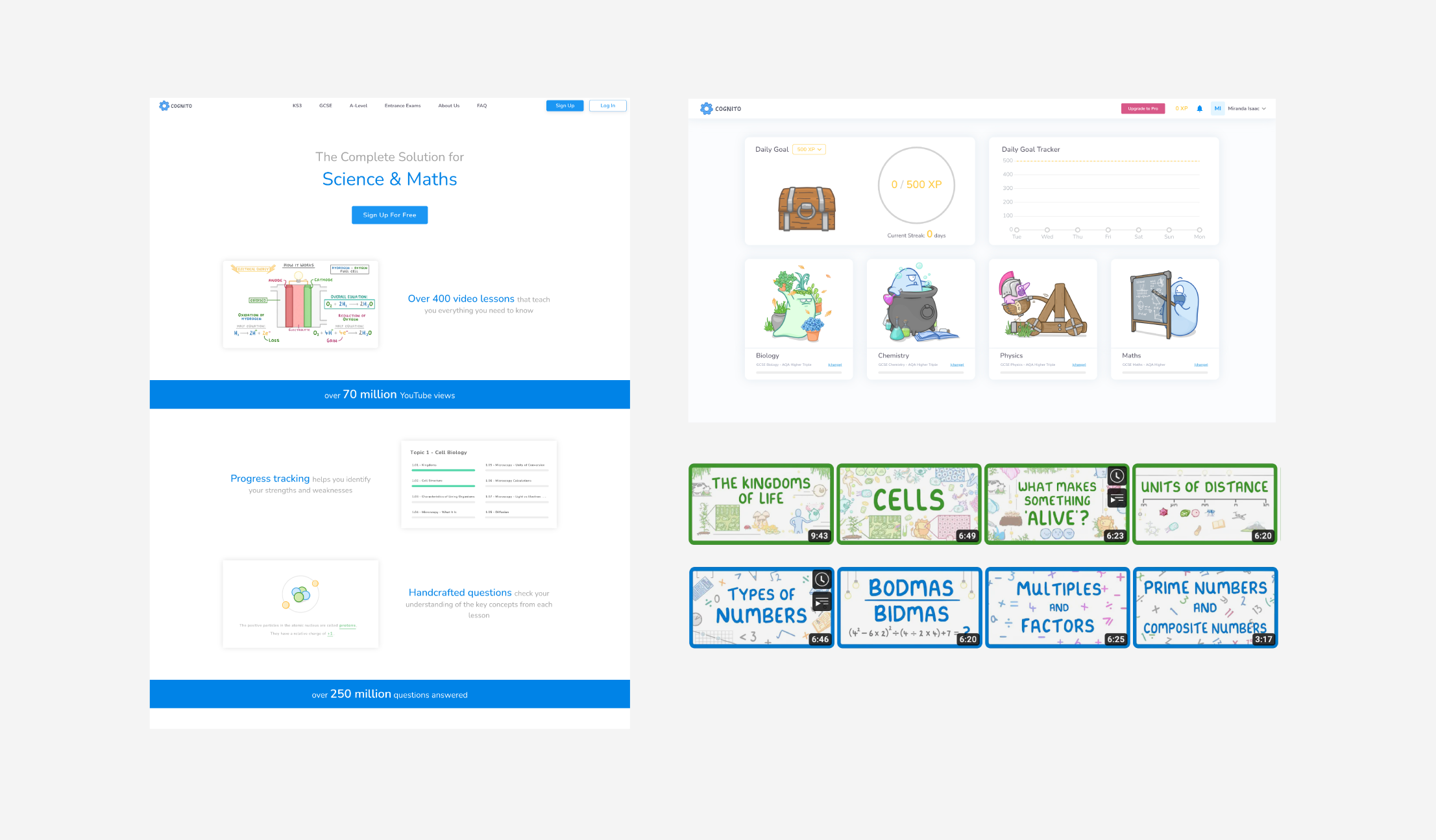
They are an education platform with a decent following of GCSE students looking for better explanations of their science topic areas and test questions. They create free video tutorials on YouTube which are the sweetners to paying for additional app services.
There’s a quite nice, personal element of the brand which appeals to students; handwritten and hand-drawn styling makes students feel as if they are speaking directly to them. However, the problem (to me) is that it looks a little dated, it feels gentle but doesn’t look fun. There’s not much of an engagement program to make students want to return (and pay) for additional services. There’s a disconnect between the hand-drawn educational drawings and the child-like alien illustrations (bearing in mind target audience is approximately 14/15 years).
The Problem
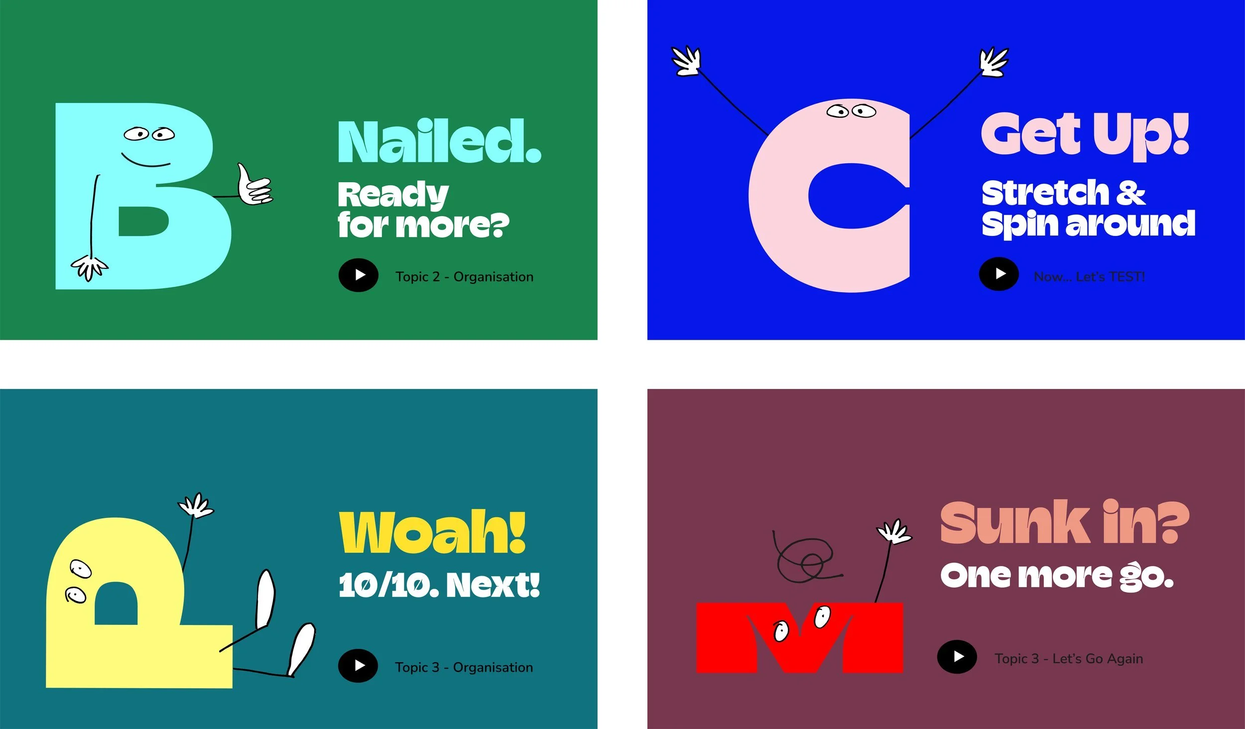
I kept the parts of the brand I thought were successful; personal and friendly. I then looked at a style of illustration/typography which borrowed the basic drawing style from the existing videos but used them differently and worked with some chunky type/characters. I added in fun messaging to engage and encourage the students.
The Solution
Current Branding
New Subject Branding

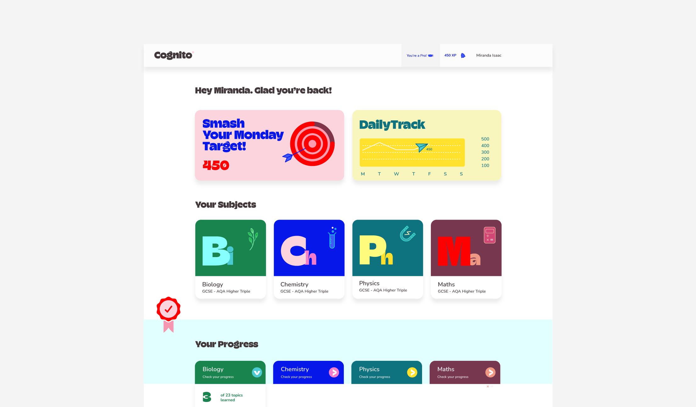
Web/App Messaging
Platform Visuals - how it could work
NB - this work wasn’t used. All rights reserved